

interactive investor
Design System Lead
The role
Working in UI Design roles prior to moving to interactive investor helped me find my calling in the world of Design Systems. I relished the opportunity to fully dedicate my time to the evolution of the Design System at the company.
PROJECT
Design System
The problem
The existing Design System had been built in an overly convoluted and inefficient way, with limited documentation guiding Designers on how to use the library.
The solution
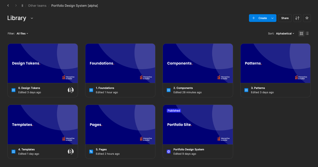
Working with the team to establish the pain points of the current Design System and liaising with other departments, I deciding to rebuild the Design System from scratch.
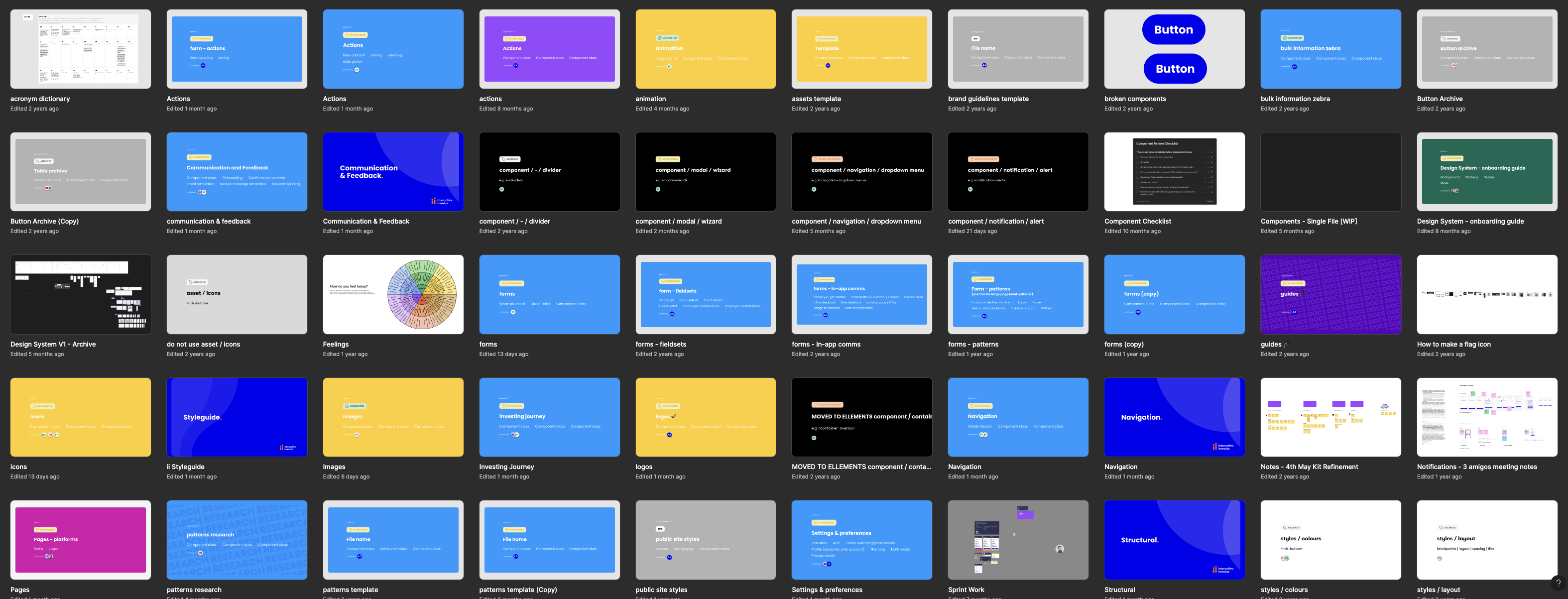
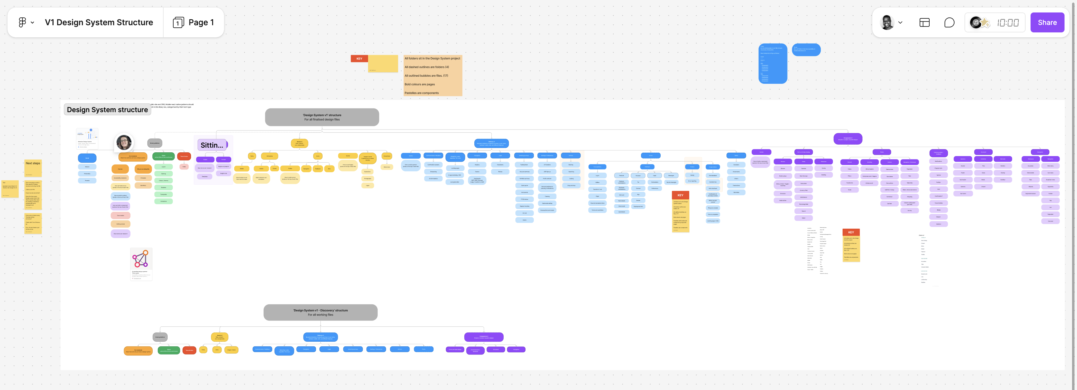
Due to the complexity of the Design System’s file structure, and the inefficient way the Components had been built, managing updates and onboarding new designers were difficult tasks.
Below is a Figjam created by the Design Principal as an overview of the Design System file structure.
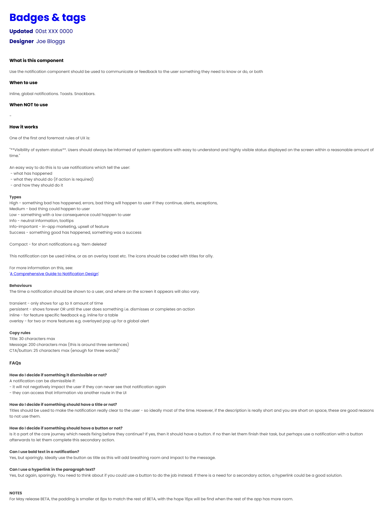
As well as being confusing to navigate, the documentation which accompanied the components when you eventually found them didn’t help the designers to use the library consistently.
Below is an example of the documentation for the Badge component.
Design Systems should make it easier for designers to create consistent experiences. When I started, it was clear that the Design System was actually making it harder.
The result was a team of UX Designers who created visually different experiences, causing confusion with the Developers they worked with, resulting in inconsistent experiences being built.
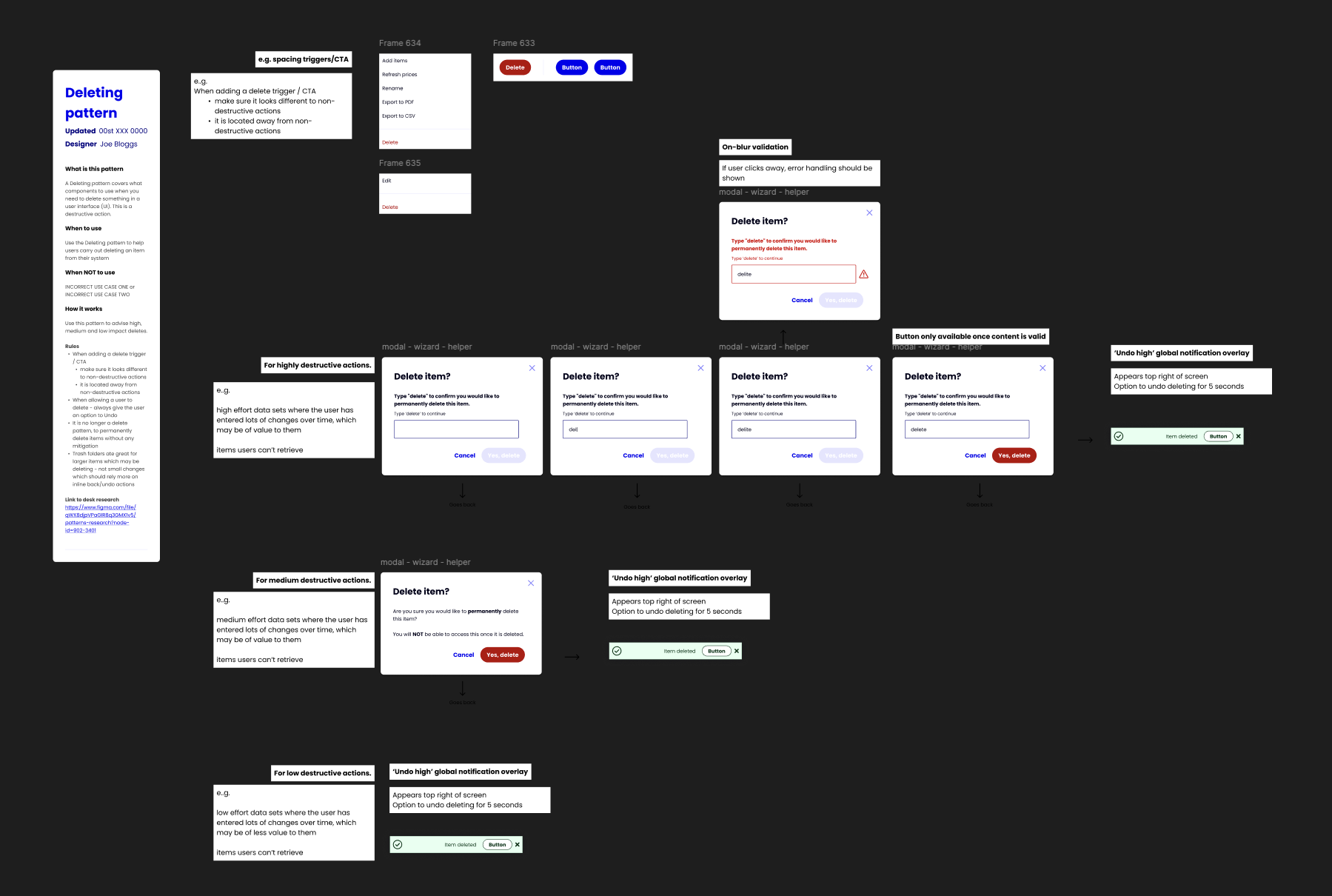
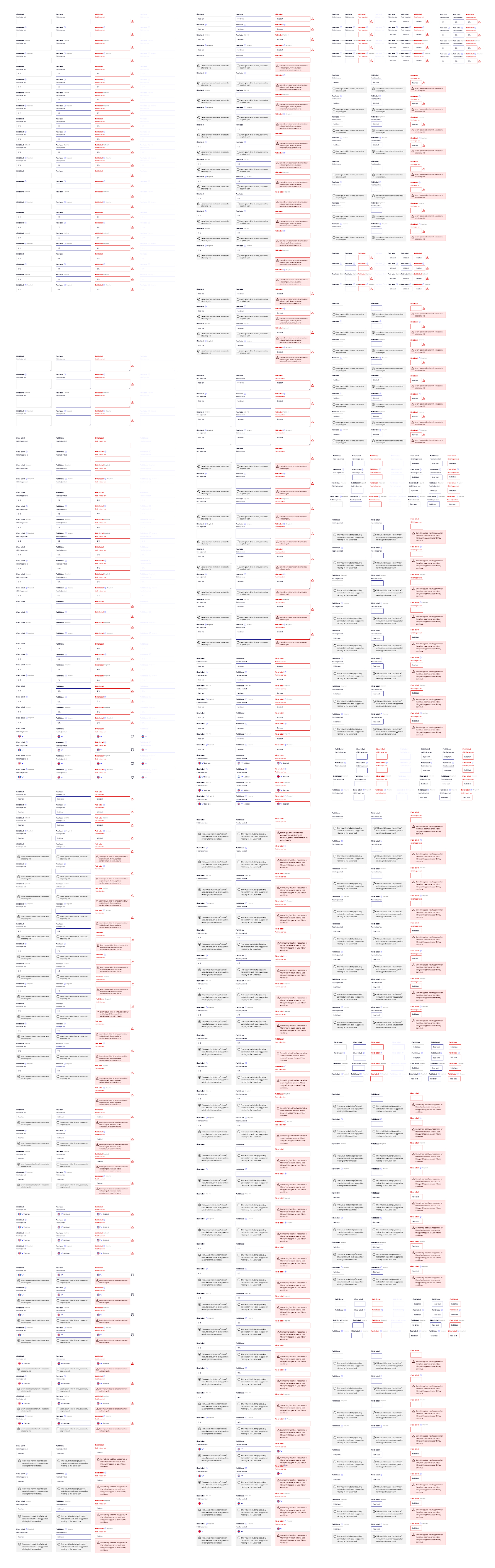
The previous Design System Lead hadn’t efficiently used properties or booleans which would have drastically helped reduce the amount of physical variants. An example of the result of this was 897 variants of an Input.
Also, everyone in the team contributed to the Design System, each with different levels of knowledge on optimal Component building. This resulted in each Component being built differently, and inconsistency in the content and structure of the Component pages.
It was clear that some structure and a dedicated person in charge of the maintenance of the Design System was needed.
I started by running a series of workshops with the team to establish what their current pain points were, and how they thought the Design System could be enhanced to make their lives easier not harder.
The common theme was that the current Design System was making it harder for the team to design quickly, efficiently and consistently. All things which a good Design System would do the opposite of.
With my knowledge of Design System structure, the value of efficient component composition utilising Figma to it’s full capabilities, I set out building a new Design System to show how simple a Design System can be.
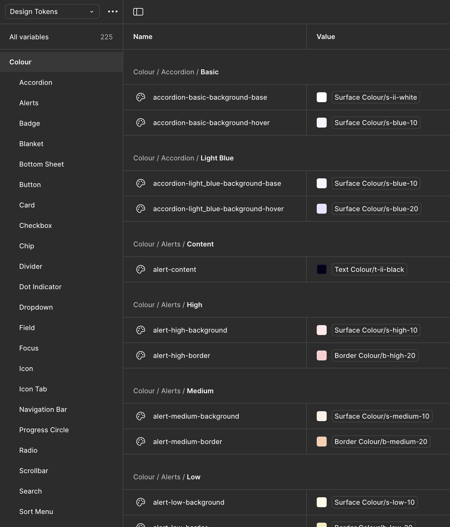
Tokens
The previous Design System didn’t use Tokens, so each designer had nearly free reign the use any colour style or manually input spacing/radius values.
Implementing Tokens for all assets gave clear guidance on when to use it, enabling more consistency in the output of the team. It also made future changes a much easier process, only having to change one value for all assets using it to automatically update.
Foundations
The previous Foundations had icons with varying thicknesses and style, colours which were visually similar, no Mobile Web typography scale, and limited guidance on breakpoints.
I stripped the colours back to the essentials, reducing clutter and the confusion created by visually similar colours. We used the Nucleo UI Essentials icon pack to replace the inconsistently designed icon library. II also implemented guidance on fluidity when designing at different breakpoints, and a whole new typography scale which included Mobile Web sizes.
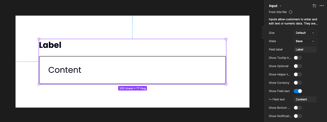
Components
The existing Components had been built by various members of the team, resulting in an inconsistent approach to properties and naming conventions. They also were overly built, not using booleans efficiently, which led to way too many physical variants.
With my knowledge on optimal Component composition, I rebuilt every Component from the ground up, ensuring that all the necessary variants were still available through the properties panel, but drastically reducing the amount of physical variants.
An example of this was reducing the 897 physical variants of an Input down to just 18, all while maintaining the possibility of creating the 897 variants through efficient usage of booleans and properties.
While streamlining the amount of physical components was important to make the pages less overwhelming, I didn’t want any of the variants to be lost. This required effective use of booleans and properties.
Input in it’s simplest form
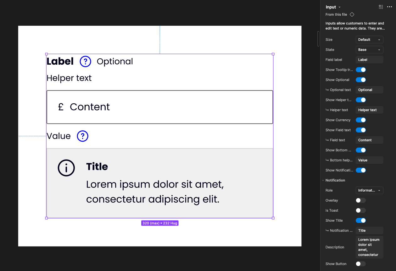
Input in it’s most complex form
Reducing the amount of physical variants made maintaining and updating each component much easier. Changes now didn’t involve spending hours editing endless variants, and publishing changes to the Design System became much quicker.
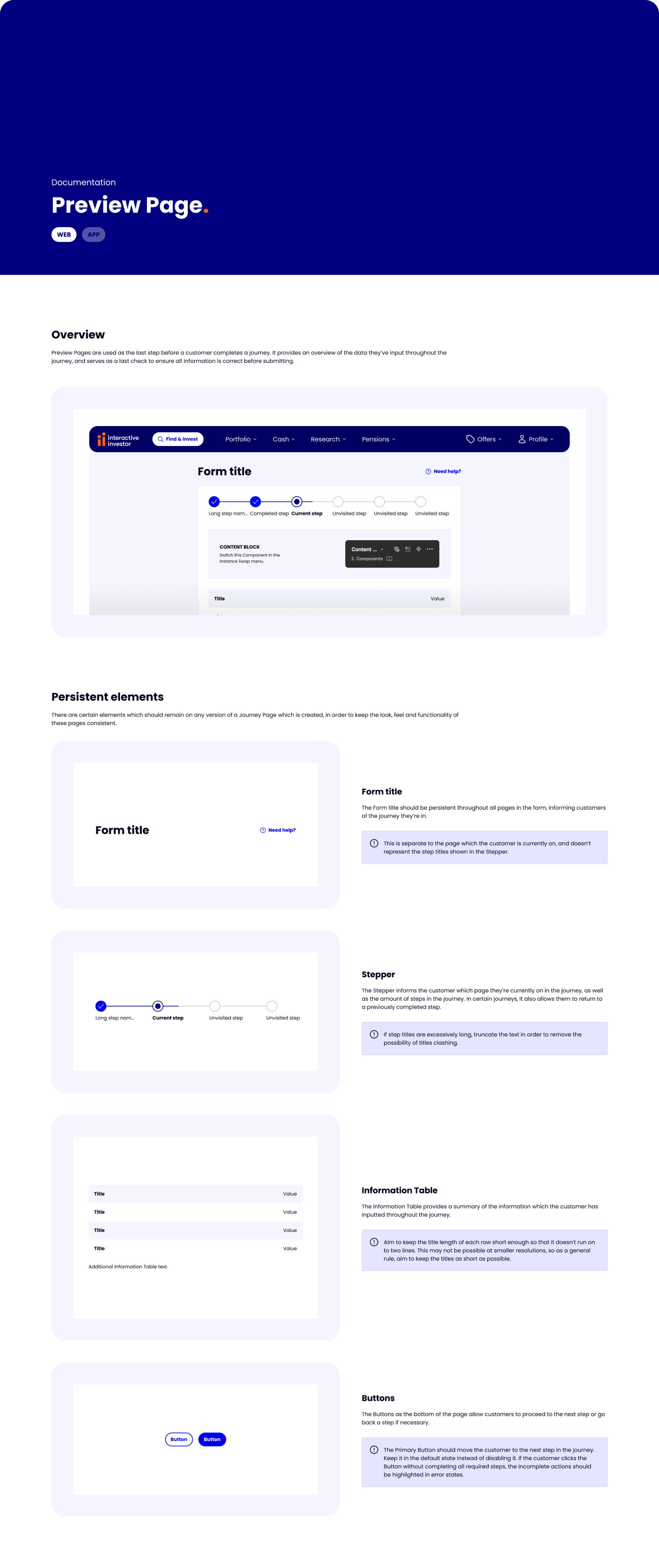
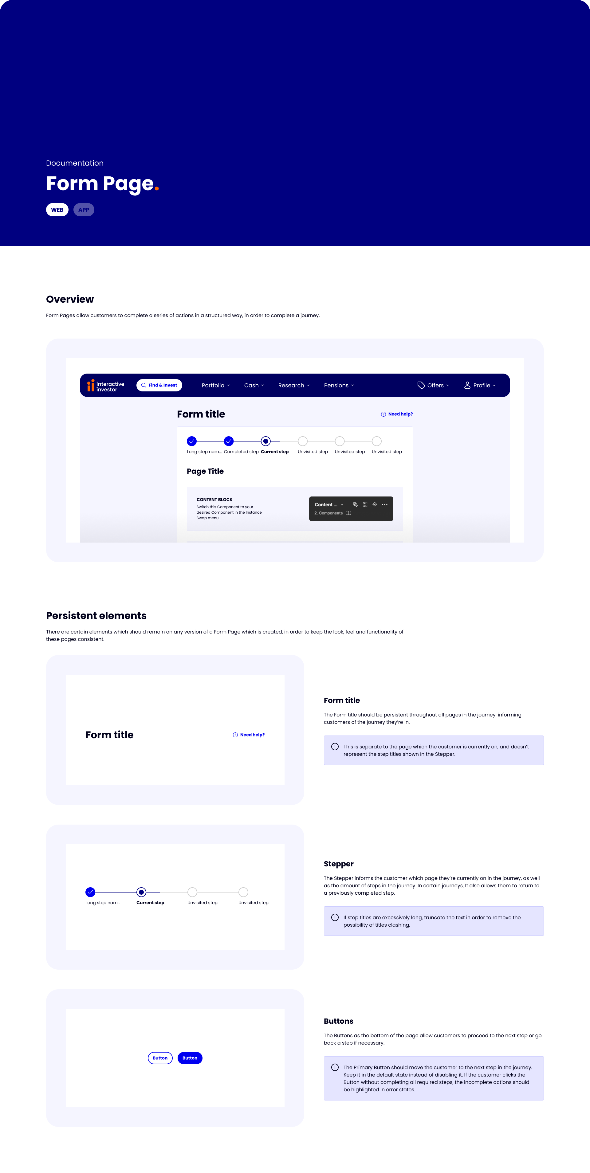
Documentation was also created to ensure that designers knew how to correctly use each Component, further increasing the visual consistency of the output across the team.
Patterns
Patterns followed much the same approach as Components, with complete rebuilds of each one, and accompanying documentation to aid the correct usage across the team.
There was previously no clear differentiation between Components and Patterns, with the assumption that Patterns were just complex Component combinations.
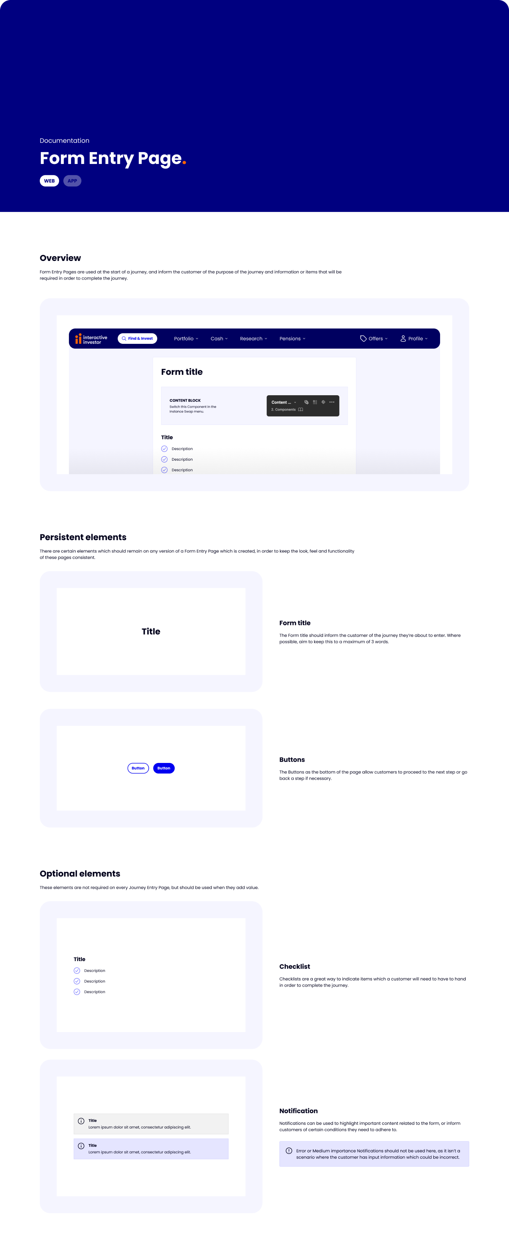
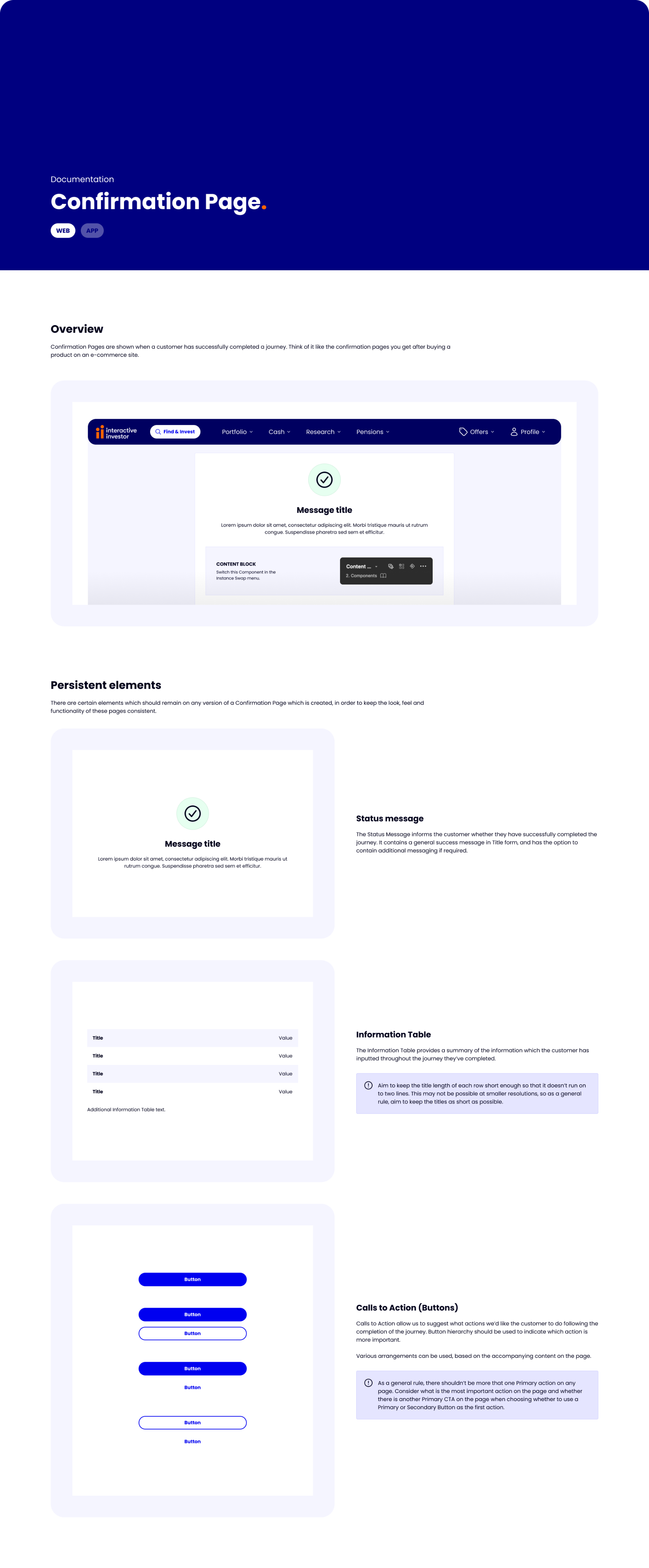
Templates
A lot of the interactive investor site when logged in is form-based. Designers previously had no templates to work from, resulting in various spacing and positioning of assets being used.
To bring consistency to the pages the team created, I built Templates of each major page as a Component, predefined the spacing and positioning of items like Buttons, and massively reduced the time it took to create a page from scratch.
As well as saving designers time, this resulted in much more consistent end products.
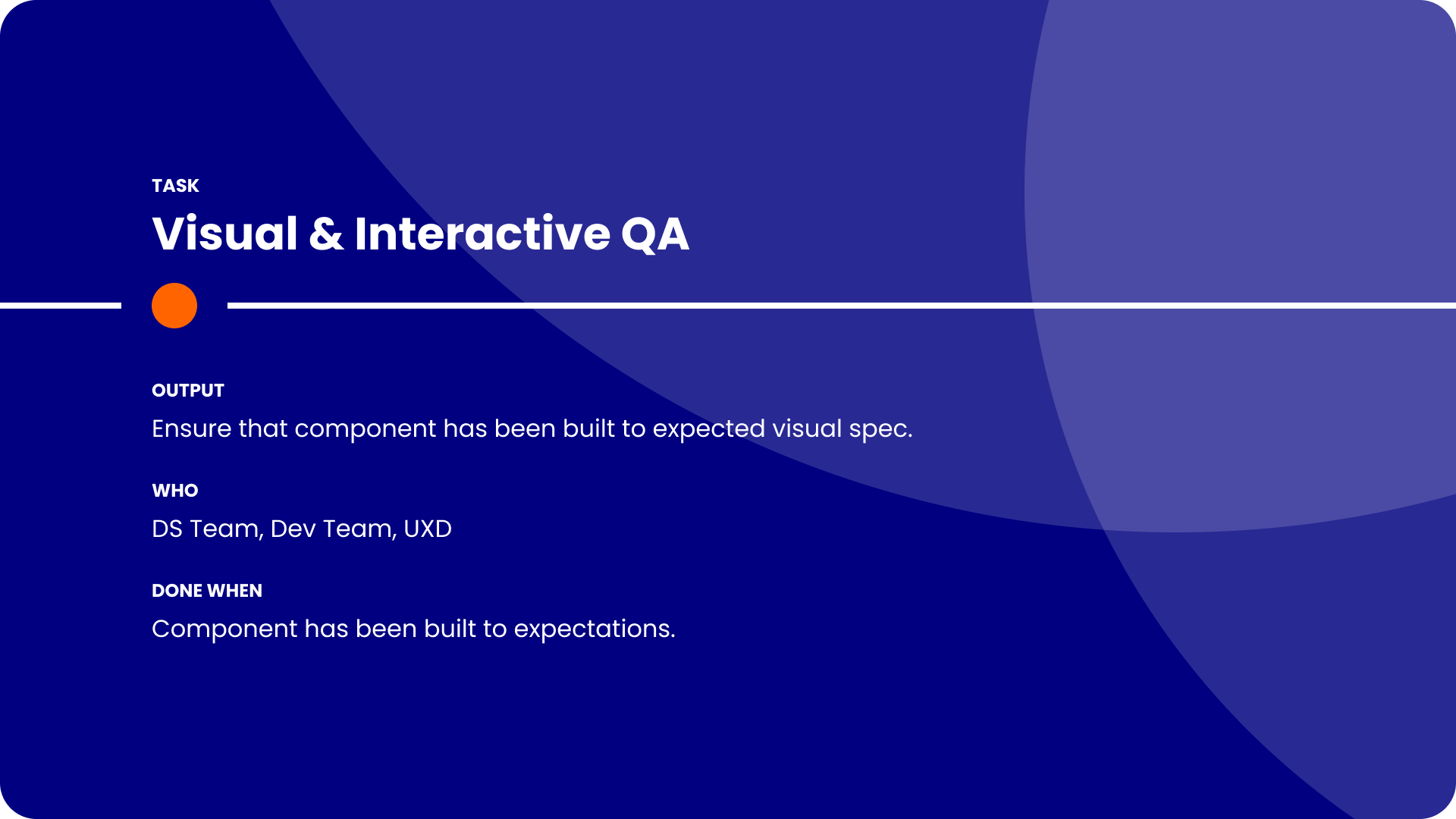
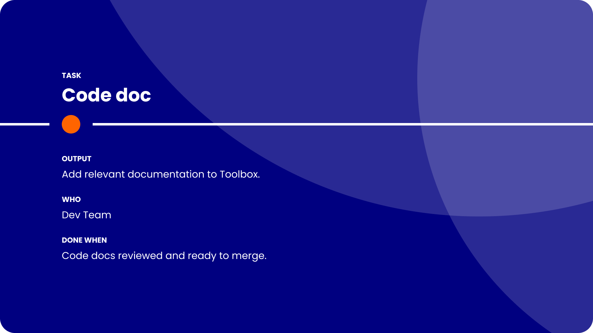
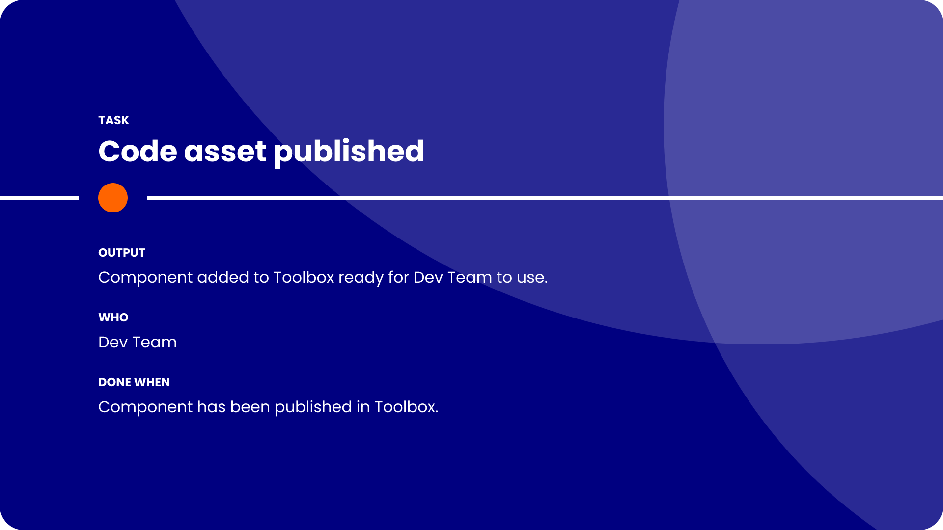
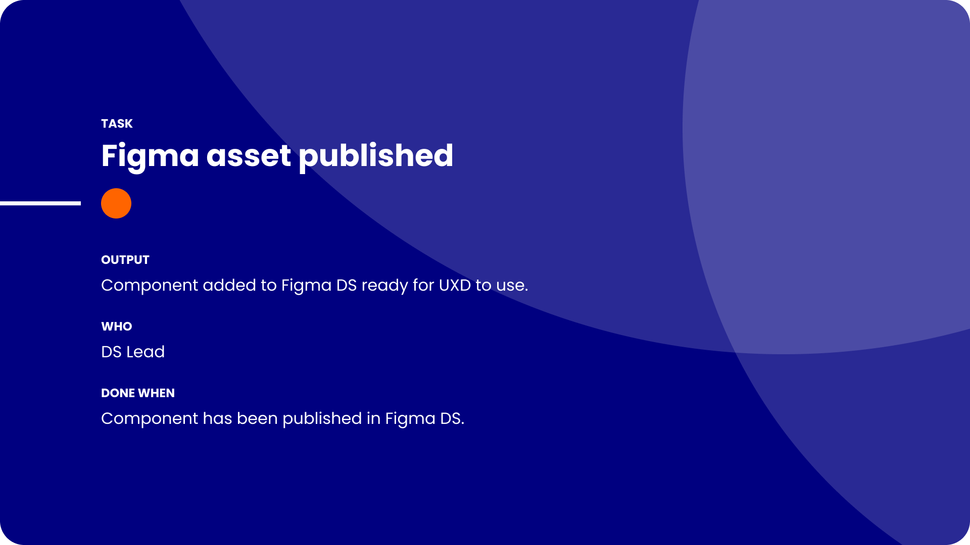
Request workflow
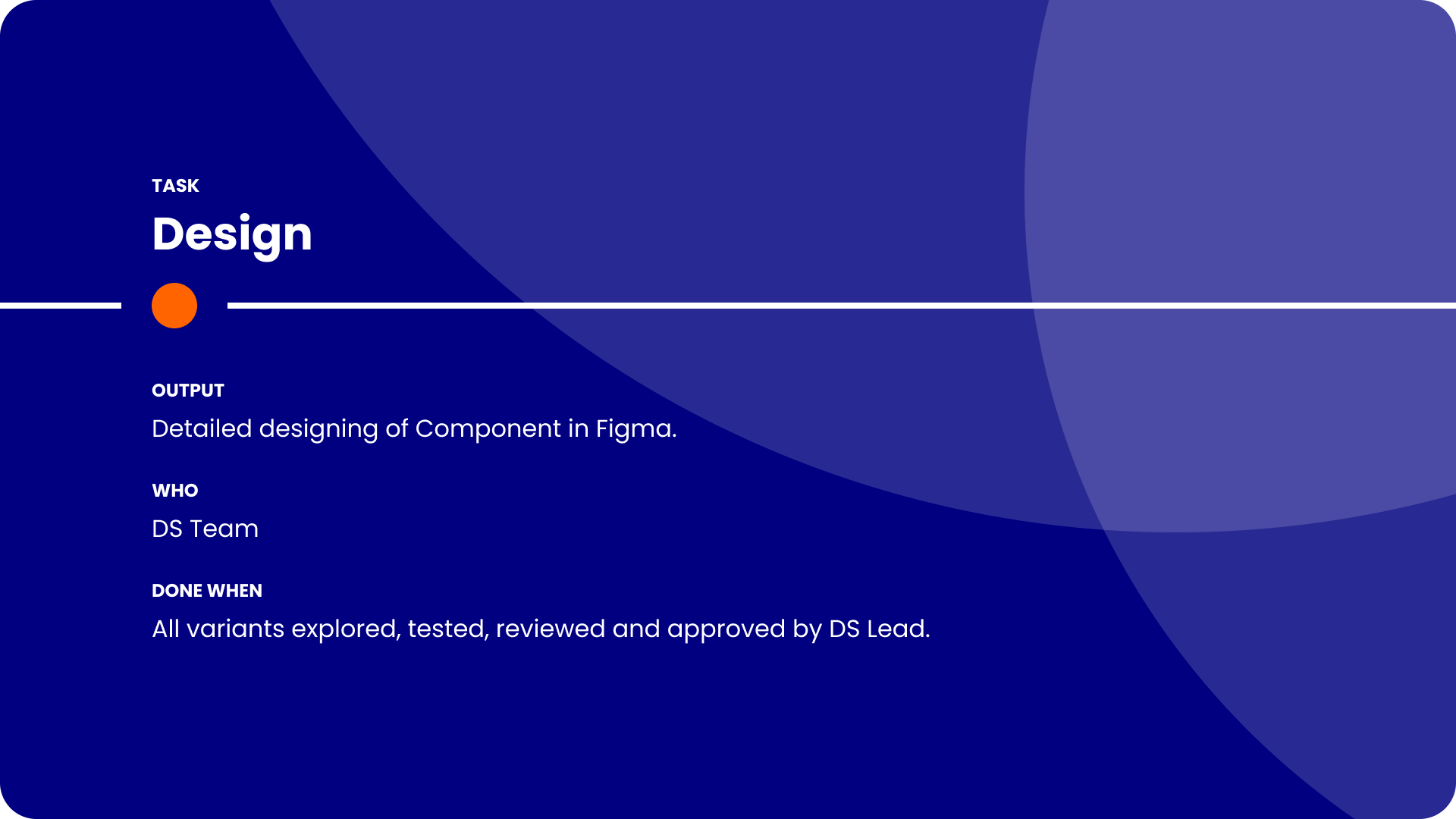
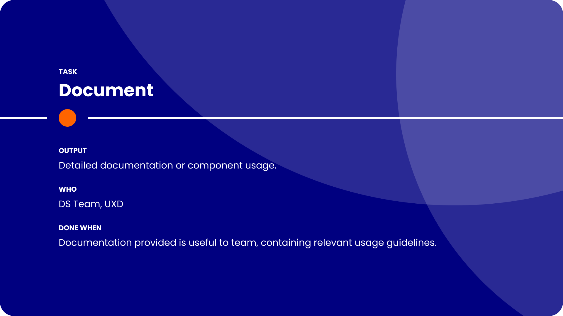
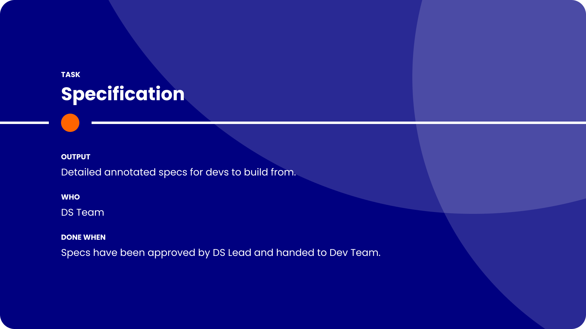
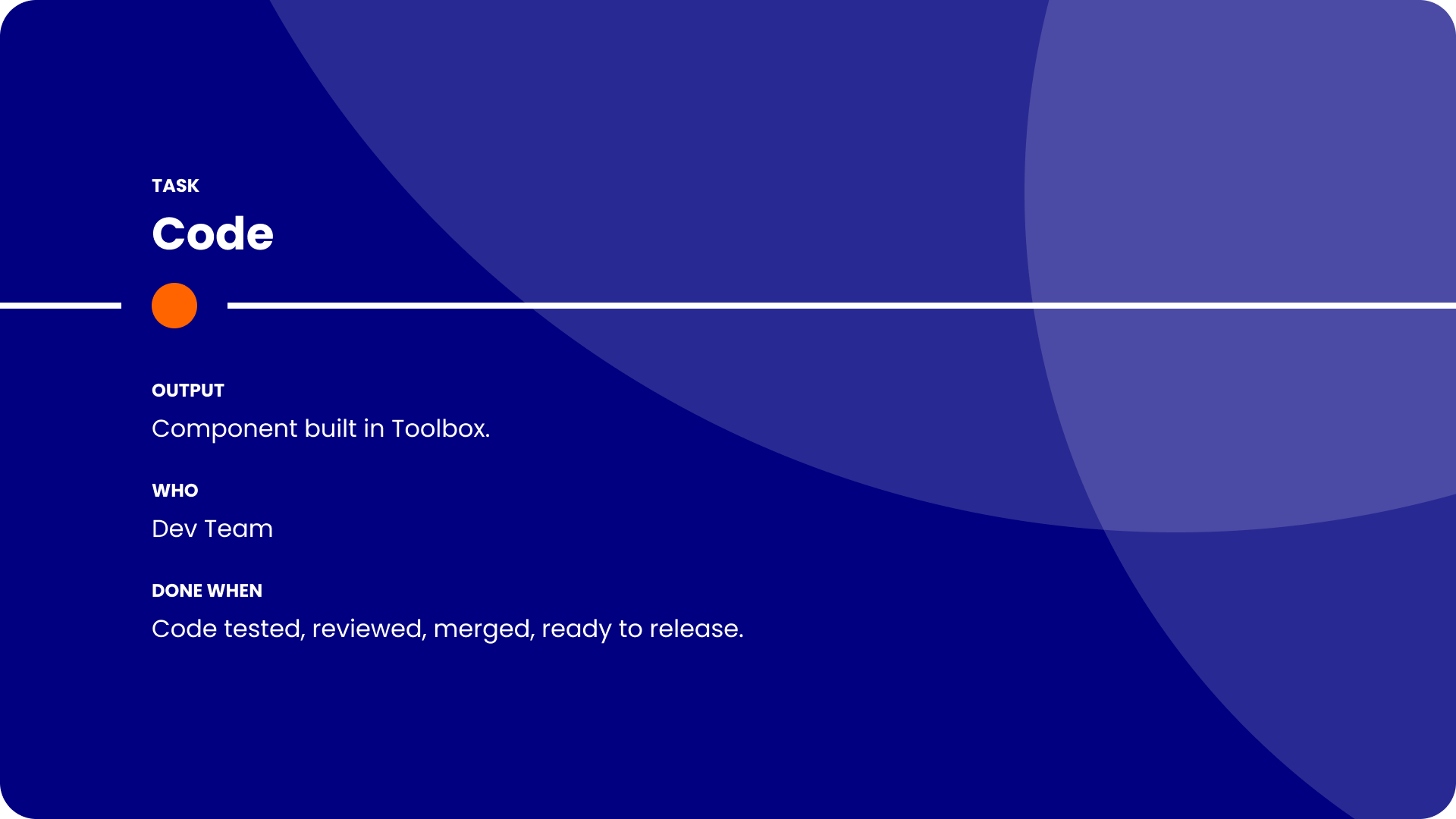
When I started, everyone in the team contributed to the Design System, leading to inconsistent levels of component construction, and no official way of working.
Designers often left WIP or unfinished assets in the Design System, leading to confusion in the team over what was live and safe to use.
To increase visibility of the status of a new addition, the rationale behind it, and track the progress of it from idea to implementation, I established a workflow for new requests.
Instead of the free-for-all as was the previous approach, this approach enabled the Design System Team to be the main contributors to the Design System, thus ensuring higher levels of consistency in the building of new assets.
To quantify how much quicker it was for designers to create experiences with the new components, I ran a series of timed tests, asking the designers to create a full page from scratch using the existing Design System and then the same page again using the one I’d built.
The result
The end result of the Design System rebuild was an enhanced and more enjoyable experience for anyone using it. Designers felt more confident with their designs, not having to detach Components to fit their desired use cases. Developer actually enjoyed viewing the pages, as they were previously put off by the lack of visual appeal and the confusing file structure.
This new approach to managing the Design System prompted the developers to engage more with the Design System, and led to a project to update the Storybook library to be aligned with the new Design System.
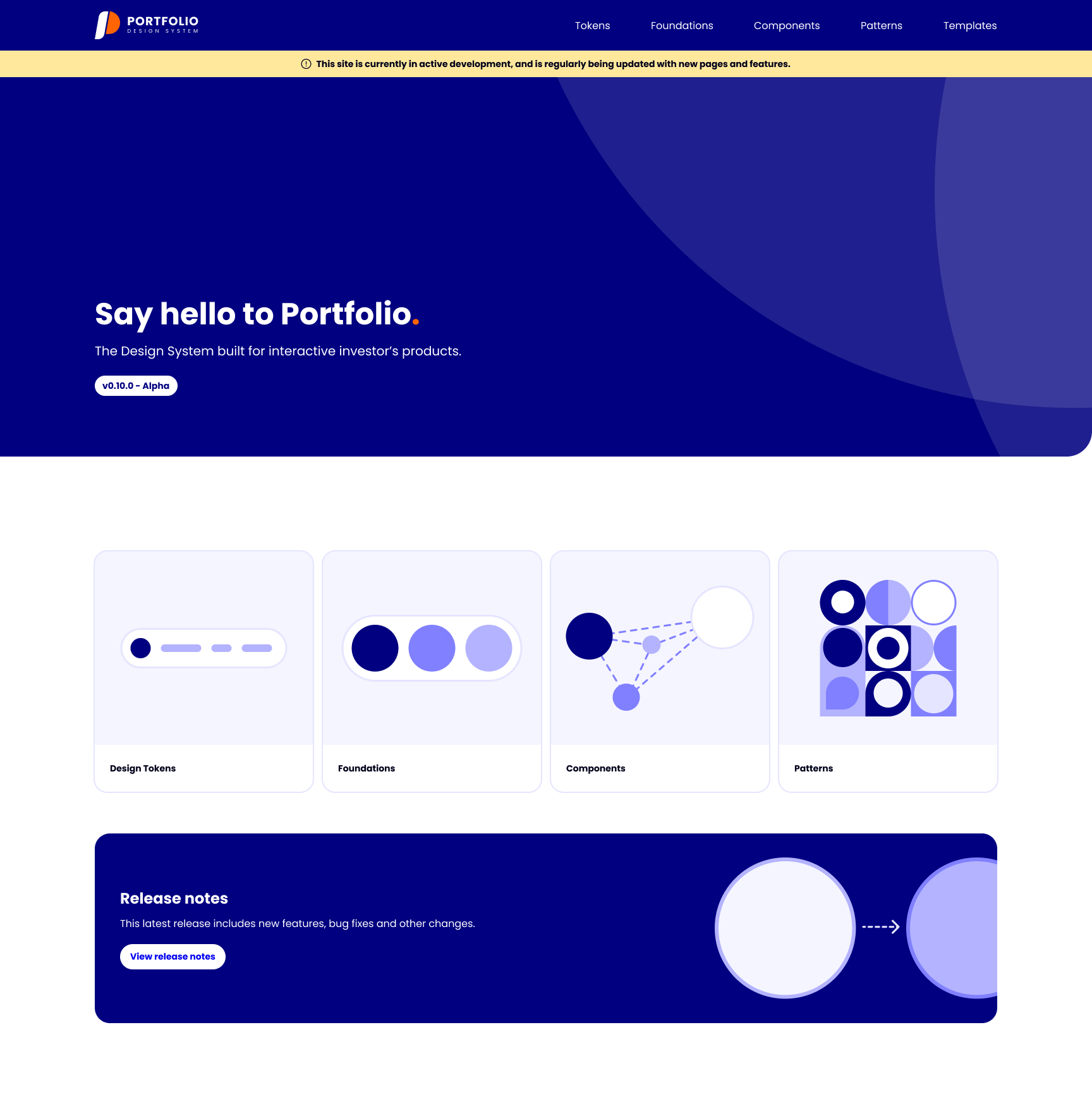
Using Figma Sites, I created an internal-facing Design System site, which served as the middle ground between Figma and Storybook, and is now used by various departments across the company.


Let’s connect
Passionate about Design Systems? Interesting in working together? Just want to say hi?
Find me on LinkedIn and let’s connect!
Connect on LinkedIn


Every time a designer detaches a component, a flower stops blooming.
interactive investor
Design System Lead
The role
Working in UI Design roles prior to moving to interactive investor helped me find my calling in the world of Design Systems. I relished the opportunity to fully dedicate my time to the evolution of the Design System at the company.
PROJECT
Design System
The problem
The existing Design System had been built in an overly convoluted and inefficient way, with limited documentation guiding Designers on how to use the library.
The solution
Working with the team to establish the pain points of the current Design System and liaising with other departments, I deciding to rebuild the Design System from scratch.
Due to the complexity of the Design System’s file structure, and the inefficient way the Components had been built, managing updates and onboarding new designers were difficult tasks.
Below is a Figjam created by the Design Principal as an overview of the Design System file structure.
As well as being confusing to navigate, the documentation which accompanied the components when you eventually found them didn’t help the designers to use the library consistently.
Below is an example of the documentation for the Badge component.
Design Systems should make it easier for designers to create consistent experiences. When I started, it was clear that the Design System was actually making it harder.
The result was a team of UX Designers who created visually different experiences, causing confusion with the Developers they worked with, resulting in inconsistent experiences being built.
The previous Design System Lead hadn’t efficiently used properties or booleans which would have drastically helped reduce the amount of physical variants. An example of the result of this was 897 variants of an Input.
Also, everyone in the team contributed to the Design System, each with different levels of knowledge on optimal Component building. This resulted in each Component being built differently, and inconsistency in the content and structure of the Component pages.
It was clear that some structure and a dedicated person in charge of the maintenance of the Design System was needed.
I started by running a series of workshops with the team to establish what their current pain points were, and how they thought the Design System could be enhanced to make their lives easier not harder.
The common theme was that the current Design System was making it harder for the team to design quickly, efficiently and consistently. All things which a good Design System would do the opposite of.
With my knowledge of Design System structure, the value of efficient component composition utilising Figma to it’s full capabilities, I set out building a new Design System to show how simple a Design System can be.
Tokens
The previous Design System didn’t use Tokens, so each designer had nearly free reign the use any colour style or manually input spacing/radius values.
Implementing Tokens for all assets gave clear guidance on when to use it, enabling more consistency in the output of the team. It also made future changes a much easier process, only having to change one value for all assets using it to automatically update.
Foundations
The previous Foundations had icons with varying thicknesses and style, colours which were visually similar, no Mobile Web typography scale, and limited guidance on breakpoints.
I stripped the colours back to the essentials, reducing clutter and the confusion created by visually similar colours. We used the Nucleo UI Essentials icon pack to replace the inconsistently designed icon library. II also implemented guidance on fluidity when designing at different breakpoints, and a whole new typography scale which included Mobile Web sizes.
Components
The existing Components had been built by various members of the team, resulting in an inconsistent approach to properties and naming conventions. They also were overly built, not using booleans efficiently, which led to way too many physical variants.
With my knowledge on optimal Component composition, I rebuilt every Component from the ground up, ensuring that all the necessary variants were still available through the properties panel, but drastically reducing the amount of physical variants.
An example of this was reducing the 897 physical variants of an Input down to just 18, all while maintaining the possibility of creating the 897 variants through efficient usage of booleans and properties.
While streamlining the amount of physical components was important to make the pages less overwhelming, I didn’t want any of the variants to be lost. This required effective use of booleans and properties.
Input in it’s simplest form
Input in it’s most complex form
Reducing the amount of physical variants made maintaining and updating each component much easier. Changes now didn’t involve spending hours editing endless variants, and publishing changes to the Design System became much quicker.
Documentation was also created to ensure that designers knew how to correctly use each Component, further increasing the visual consistency of the output across the team.
Patterns
Patterns followed much the same approach as Components, with complete rebuilds of each one, and accompanying documentation to aid the correct usage across the team.
There was previously no clear differentiation between Components and Patterns, with the assumption that Patterns were just complex Component combinations.
Templates
A lot of the interactive investor site when logged in is form-based. Designers previously had no templates to work from, resulting in various spacing and positioning of assets being used.
To bring consistency to the pages the team created, I built Templates of each major page as a Component, predefined the spacing and positioning of items like Buttons, and massively reduced the time it took to create a page from scratch. As well as saving designers time, this resulted in much more consistent end products.
Request workflow
When I started, everyone in the team contributed to the Design System, leading to inconsistent levels of component construction, and no official way of working.
Designers often left WIP or unfinished assets in the Design System, leading to confusion in the team over what was live and safe to use.
To increase visibility of the status of a new addition, the rationale behind it, and track the progress of it from idea to implementation, I established a workflow for new requests.
Instead of the free-for-all as was the previous approach, this approach enabled the Design System Team to be the main contributors to the Design System, thus ensuring higher levels of consistency in the building of new assets.
To quantify how much quicker it was for designers to create experiences with the new components, I ran a series of timed tests, asking the designers to create a full page from scratch using the existing Design System and then the same page again using the one I’d built.
The result
The end result of the Design System rebuild was an enhanced and more enjoyable experience for anyone using it. Designers felt more confident with their designs, not having to detach Components to fit their desired use cases. Developer actually enjoyed viewing the pages, as they were previously put off by the lack of visual appeal and the confusing file structure.
This new approach to managing the Design System prompted the developers to engage more with the Design System, and led to a project to update the Storybook library to be aligned with the new Design System.
Using Figma Sites, I created an internal-facing Design System site, which served as the middle ground between Figma and Storybook, and is now used by various departments across the company.
Let’s connect
Passionate about Design Systems? Interesting in working together? Just want to say hi?
Find me on LinkedIn and let’s connect!
Connect on LinkedIn
Every time a designer detaches a component, a flower stops blooming.